- DYOR
- Posts
- 🗄️ The Ultimate Guide To Bitcoin Market Cycles
🗄️ The Ultimate Guide To Bitcoin Market Cycles
The best tools and indicators for understanding what phase of the market you're in
Krystian Streit
May 5th, 2023
If there’s one thing just about EVERY investor wishes they had, it would be a crystal ball to look into the future to tell when the tops and bottoms of markets formed.
If you’ve ever heard the words “investing”, “markets”, “stocks”, etc.
Then you’ve 100% heard of the phrase.
“Buy Low, Sell High”
Unfortunately, the PROBLEM is that we can’t see into the future, which is why some people will spend their entire lives analyzing and dissecting the markets, trying to gain an edge.
📝 The Formula
I’m here to tell you that you don’t have to spend your life studying the markets to understand them or lose your life savings by listening to Jim Cramer.
Below are 6 BTC market indicators that will give you an excellent idea of where the Market is currently at while saving you 65 years of your life!
Net Unrealized Profit/Loss (NUPL)
MVRV Z-Score (Market Extremes)
Mayer Multiple
Percentage Supply In Profit
Reserve Risk
Cycle Change Detection via Drilling Method
I know that all looks EXTREMELY confusing, and that is just the nature of the beast, but remember, I’ll explain all of this without any useless jargon… well, maybe a little.
📈 Net Unrealized Profit/Loss (NUPL)
Definition:
Net Unrealized Profit/Loss is the difference between Relative Unrealized Profit and Relative Unrealized Loss. This metric can also be calculated by subtracting realized cap from the market cap, and dividing the result by the market cap
My Definition:
Unrealized = People have not sold YET, but have the potential
Profit = The more people that are in profit, the higher the odds of them taking profits
Loss = No one wants to sell at a loss; more people will be HODLing and accumulating
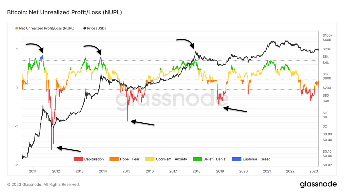
NUPL
The RED shows us when there’s capitulation (Extreme Selling) in the markets, which correlates with market bottoms.
The BLUE shows us when there’s market greed, which correlates with market tops.
I’ve also added 3 arrows on top and bottom to help you see them better.
📈 MVRV Z-Score
Definition:
The MVRV Z-Score is used to assess when Bitcoin is over/undervalued relative to its "fair value" When market value is significantly higher than realized value, it has historically indicated a market top (red zone). In contrast, the opposite has indicated market bottoms (green zone). Technically, MVRV Z-Score is defined as the ratio between the difference between market cap and realized cap, and the standard deviation of all historical market cap data, i.e. (market cap – realized cap) / std(market cap).
My Definition:
There is a fair price to pay for BTC according to the Market and many other factors.
This lets you know when you buy and over or under-valued BTC.
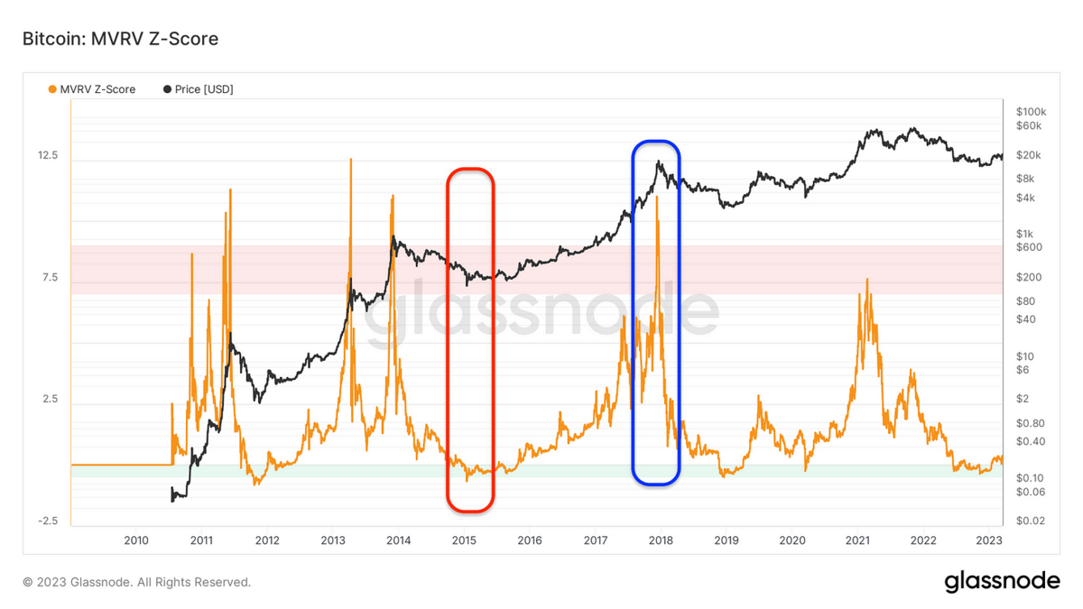
MVRV Z-Score
The RED rectangle shows us a correlation between low scores & market bottoms
The BLUE rectangle shows us a correlation between high scores & market tops
📈 Mayer Multiple
Definition:
The Mayer Multiple oscillator is calculated as the ratio between the price and the 200-day moving average. The 200-day MA is a widely recognized indicator for establishing macro bull or bear bias. The Mayer Multiple represents a measure of distance away from this long-term average price as a tool to gauge overbought and oversold conditions.
Following the original analysis, overbought and oversold conditions have historically coincided with Mayer Multiple values of 2.4 and 0.8, respectively. These multiples are then applied to the 200DMA to establish cycle top and bottom pricing models.
My Definition:
The 200-day moving average has served as an excellent indicator for long-term trend recognition, used by many traders. So the ‘Mayer Multiple’ uses this moving average, then multiplies the indicator by 0.8 & 2.4 to give us a range.
This range looks similar to a tunnel; when the price is higher than the top line, price can be considered overbought (bullish) OR oversold (bearish) if it is closer to the bottom line.
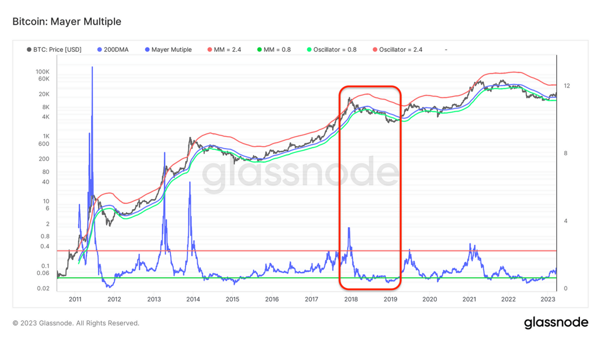
Mayer Multiple
The RED rectangle shows both an overbought & oversold scenario and how the indicator can be used to spot the top and bottom.
📈 Percentage Supply In Profit (Market Extremes)
My Definition:
This is one of the easier charts to understand; the more investors are in profit, the odds are you are near the top of the Market.
The MAIN goal of investing is to make money, and if everyone is currently in profit/making money, then you should expect the Market to sell off relatively soon!
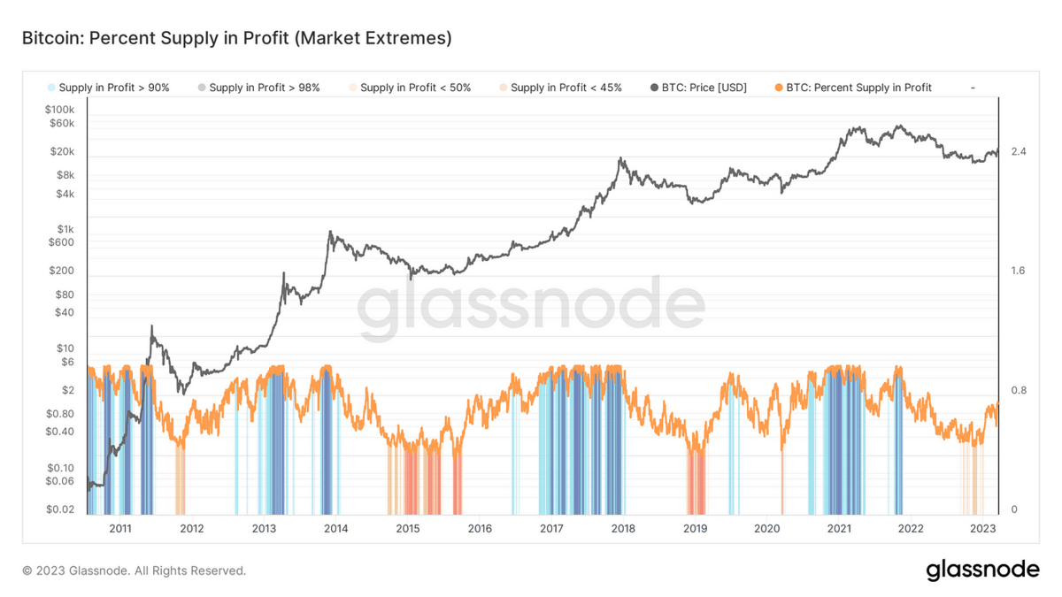
Percentage Supply In Profit
Blue = People are in profit (Sell off coming soon)
Orange = People are not in profit (Accumulation phase)
📈 Reserve Risk
Definition:
Reserve Risk is defined as price / HODL Bank. It is used to assess the confidence of long-term holders relative to the price of the native coin at any given point in time. When confidence is high and price is low, there is an attractive risk/reward to invest (Reserve Risk is low). When confidence is low and price is high, risk/reward is unattractive (Reserve Risk is high).
This metric was created by @hansthered. For more information see this article.
My Definition:
This is a great way to gauge what smart money might do; typically, smarter investors follow the rule of…
When the price is cheap/low, there is less risk & more reward to buy the asset. This is when the orange line is in the green area.
When the price is expensive/high, the asset has more risk and less upside to keep providing gains. This is when the orange line is in the red danger zone.
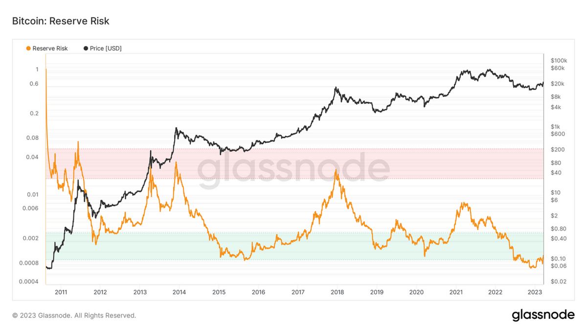
Reserve Risk
📈 Cycle Change Detection
Definition:
This model attempts to detect transitional periods between bull and bear (green) markets and bear to bull (red) markets. It is developed by assessing periods where both the correlation between Price and Percent Supply in Profit deteriorates below 0.75, and where a select indicator for extreme bull/bear is reached.
Transition from Bear to Bull Market 🟢, where the bear market is at its later stages and sellers are exhausted. The remaining investor cohort becomes reluctant to move their funds at depressed prices, and thus the correlation between price and supply profitability deviates from the 0.9-1 range.
Transition from Bull to Bear Market 🔴, where the bull market enters an exuberant parabolic phase, and nearly 100 percent of the supply is in profit as prices trade to new ATHs. Therefore, the correlation between price and profitability diminishes until the Market enters a sustained correction.
My Definition:
This one has a lot of stuff behind the scenes, so let’s keep it simple.
When price, supply in profit, & another select indicator show the Market to be very bullish, the BLUE bars will start to appear. This means we may be close to the top.
When the RED bars appear, we could set the floor for BTC or be very close.
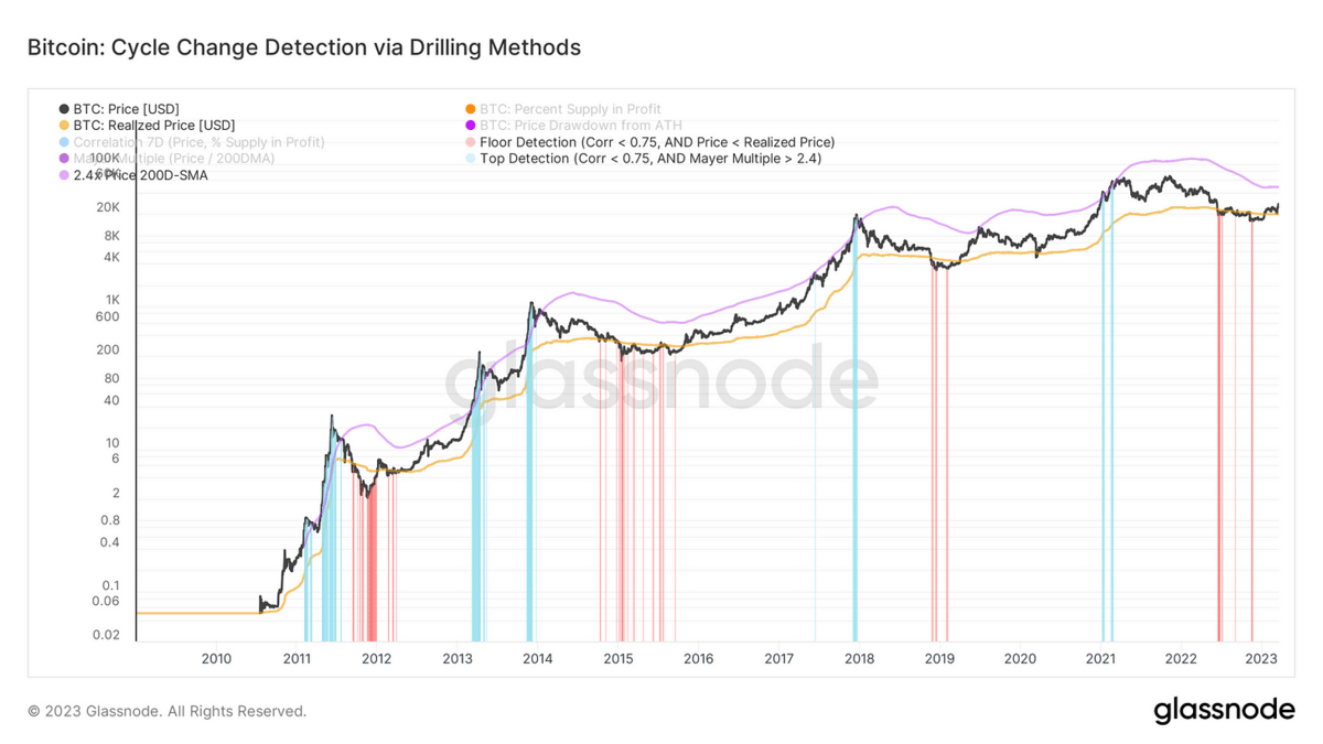
Cycle Change Detection via Drilling Method
Takeaways
No single or group of indicators will be 100% accurate
Indicators are just one piece of the puzzle; you MUST take the information given to you and pair it with what’s happening in the markets and the world
Think of indicators as ALARMS; if one goes off, it should get your attention; if multiple are going off, it might be telling you something significant
Investing is 90% mental/psychological.
Master your emotions, and you have mastered the markets.
Continue to educate yourself and use as many tools as you’re comfortable with in order to give yourself an edge in these markets.
- Krystian
DISCLAIMER: None of this is financial advice. This newsletter is strictly educational and is not investment advice or a solicitation to buy or sell any assets or to make any financial decisions. Please be careful and do your own research.
Reply